Quick-Serve Beverages
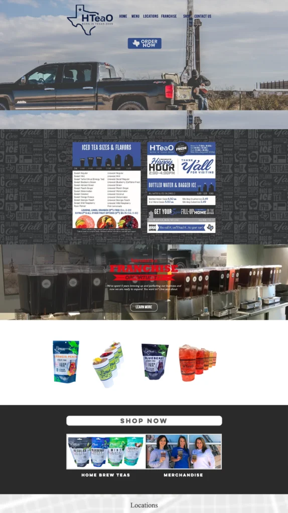
When HTeaO first reached out to us for a quote for a website rebuild, we had never heard of their brand. HTeaO already had about 35 open locations with more on the way in their home market of DFW. The first thing to do was to get acquainted with the brand and understand what makes it special in the industry and what makes it unique in the eyes of the loyal customer. Most brands and the agencies that represent them try to tell the marketplace who they want to be. In order to optimize success, brands should get their identity by letting their consumers tell them who they really are. HTeaO had an opinion on who they thought they were, but their customers knew who they really were.
Burn Media Co. helped HTeaO to understand what their brand identity really was. Then, we helped them build a website and an ad strategy to best display their brand! In order to do this we had to understand where HTeaO was starting from and where they wanted to go as a business.
This part of the process is all about numbers. In order to create a marketing strategy that connects to consumers and influences purchasing behavior to the point that business goals become tangible and achievable, we first have to quantify what those goals are and reverse engineer our path to get there.
HTeaO had a few quantitative goals and a few qualitative goals. The quantitative goals were simple: more traffic, more visitors, more social interaction, and ultimately more revenue. The qualitative goals were more abstract: “we want our new site to feel like us!” “we want our new site to make people smile!” NOW WE’RE GETTING SOMEWHERE!
Now that we understood both the results they wanted to achieve and the feelings they wanted to give customers, we had everything we needed to make something special.
Scoping
The beginning.
HTeaO is a brand that, at the time, was bringing a very new take on a time tested concept to the market. Their product is what sets them apart from the competition and if one feature stands at the forefront, it’s how colorful their brand can be.
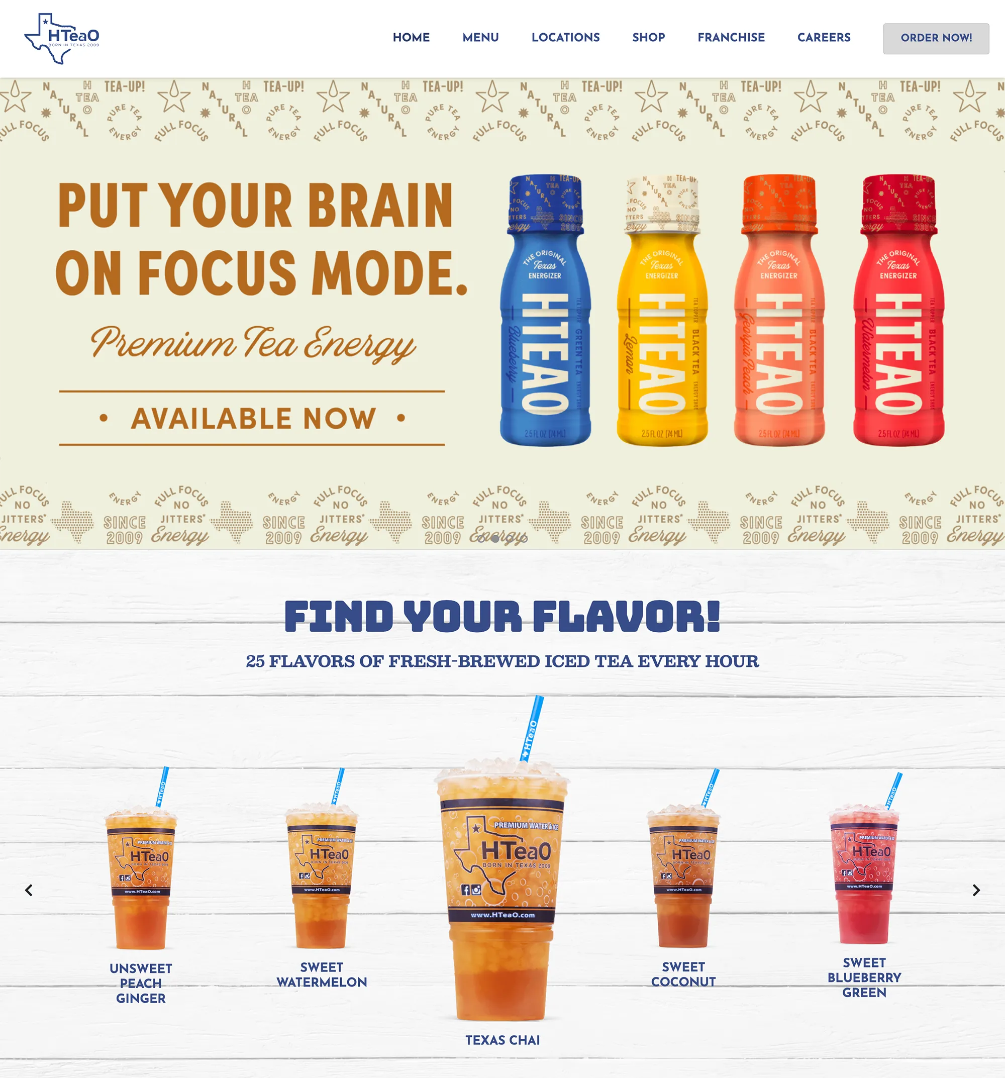
Their brand colors are muted, but that gave us the perfect platform to bring their products to life on the pages.
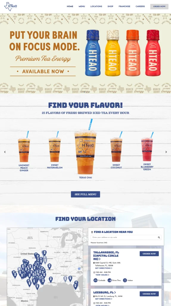
Next, we focused on the key features that we needed visitors to pay attention to – those big beautiful cups of tea and where to find them! This meant dedicating space to these features and doing so in a way that is easy and a joy for visitors to interact with.
Creative
The process.
These things considered, we got straight to work on a wireframe, meeting regularly with the client to make sure that we were bringing a vision to life that they could believe and be confident in.
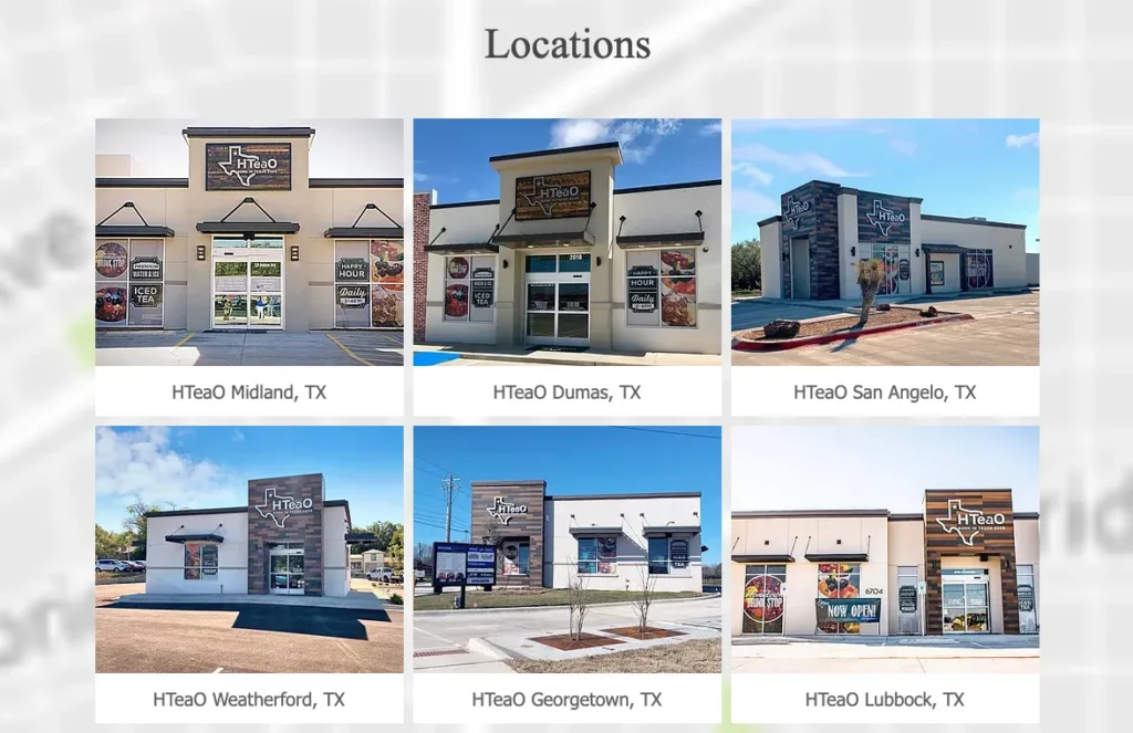
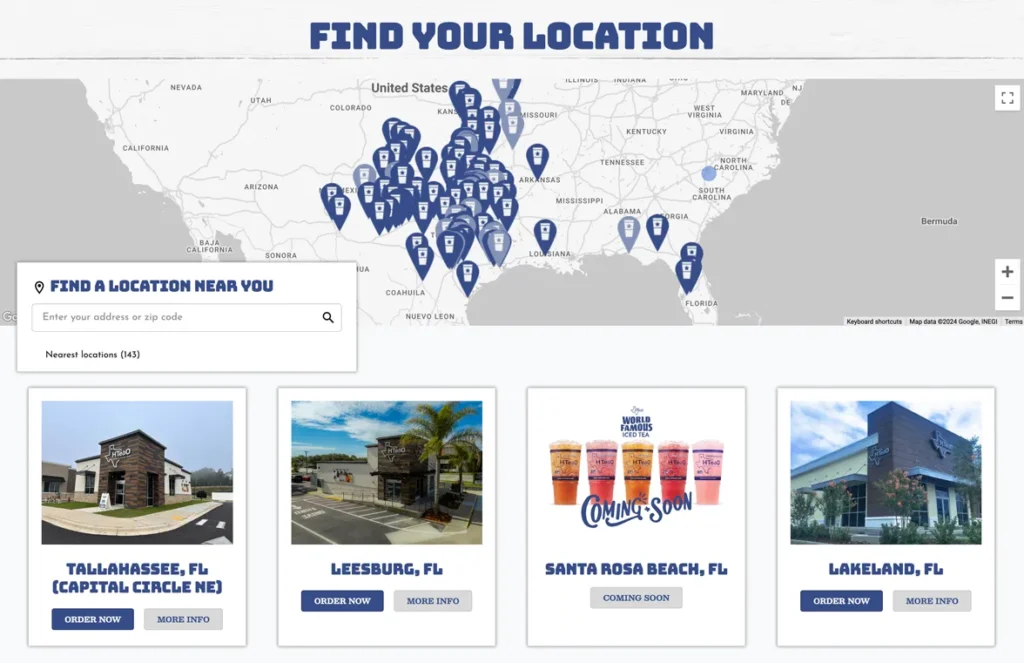
We gave the site a map that was easy to navigate and hone in on the visitor’s local HTeaO location, narrowing down the page’s search results and bringing them to a dedicated location page with all the information they needed to get their tea on!
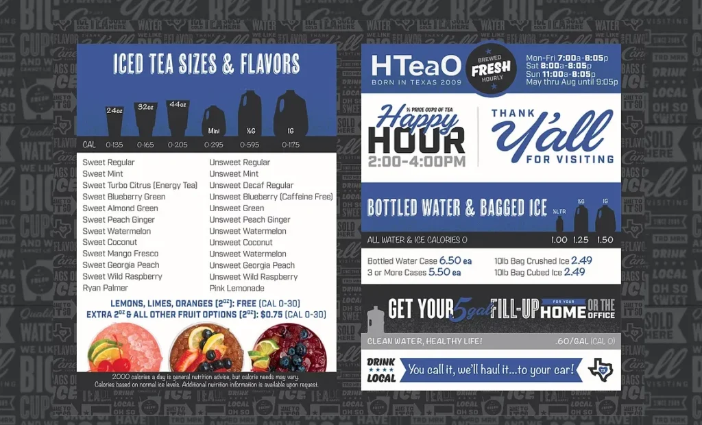
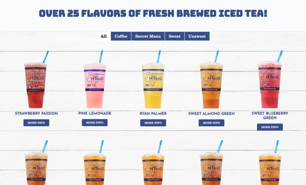
Secondly, we did away with the outdated single image of a menu and blew it up into a full-fledged line up of flavors, complete with visuals that had us in the office salivating more than a few times.
Delivery and
Implementation
We know that a site that’s pretty will only get you so far. If it doesn’t work for your customers, it’s basically useless.
Your website is an expression of your business, but it’s also a tool and a resource. We wanted to make sure that the site was jam packed with everything a new HTeaO customer and a drive-thru regular would find valuable.
The site was set up with location services to automatically select the closest locations to the visitor at the time of access.
Each of the menu items also included a full breakdown of the ingredient and caloric information, taking all the guesswork out of of selecting that next new flavor to try.
Lastly, we always want to make sure that HTeaO was educated on and felt comfortable utilizing their own site! They paid for it, so they should be able to use it too. Eventually, after several years of a great partnership with them, the site transfer was easy, painless, and everyone was on the same page.
Results
The process.
Our partnership with HTeaO and their team has been one of our favorites to date. They trusted us to come on board their rocket ship and help them pilot it to the stars. During our time together, we helped them build a dedicated fan base, expand into several new states, and grow their footprint over 200%!
We also had a great relationship with their Franchise Development team, helping them to net swaths of new leads each week.
While we no longer work with them today, we are proud to say that the site built for them still stands firm at the front of their online presence.
We’ll bet we could do the same for your growing franchise. Drop us a line and let’s talk about it!
